
Lead Generation Form Design That Converts

You're sitting in your Prescott service business, watching website traffic arrive without enough quote requests. The phone rings while you're on a job, missed calls stack up, and the inbox fills with vague messages from people who aren't ready to hire anyone. A well-built lead generation form gives those visitors a clear next step and gives your team the information needed to respond properly.
This guide is for contractors, home-service companies, professional services, and other local businesses serving Prescott, Prescott Valley, Chino Valley, Dewey-Humboldt, and Northern Arizona. It explains how to build forms that turn more of the traffic you already have into usable inquiries, while matching the form to the visitor's intent, the service being requested, and the way your team follows up.
Table of Contents
Choosing the Right Fields Without Killing Conversions - Separate essential and optional information
Single-Step vs Multi-Step Form Layouts - Use a single step for warm, simple requests - Use multiple steps for cold traffic and real qualification
Writing the Copy, Headline, and Call to Action - Replace generic buttons with outcome language - Make errors helpful instead of hostile - Build for a Prescott phone user
Trust Signals, Privacy, and Consent That Reduce Hesitation - Separate notice from permission - Connect the form to the follow-up system
Three Lead Generation Form Templates You Can Copy Today - Template one for a Prescott roofing quote - Template two for a strategy consultation - Template three for a warm demo request
What a Lead Generation Form Really Does for Your Business
A lead generation form is more than a contact box. It creates the boundary between an anonymous website visitor and an identifiable prospect your team can route into a CRM, email workflow, sales process, or Google Ads conversion system. That matters when someone in Prescott is comparing roofers, landscaping professionals, remodelers, or other local providers and isn't ready to call yet.
Forms perform three practical jobs.
They qualify intent. Asking what service someone needs is useful. Asking for every detail your office might eventually want is usually not.
They segment inquiries. A ZIP code, service area, or job type can help you send a Prescott homeowner to the right person instead of treating every submission alike.
They improve attribution. Form submissions can feed data back into advertising and analytics platforms, helping you distinguish traffic that creates inquiries from traffic that only creates page views.
A 2024 industry survey found that 74% of businesses use web forms to generate leads, while 49.7% identify forms as their most effective conversion tool. The same survey reported that only 45% of people who visit a form convert successfully, which shows why the form itself remains a major optimization opportunity for local marketers (Fluent Forms' form statistics).
Practical rule: A field should earn its place by qualifying the lead, enabling follow-up, or personalizing the response.
The form also needs an operational handoff. If your staff can't see the submission, respond to it, and understand what the person requested, a higher submission count won't necessarily produce more booked work. Businesses that need help organizing follow-up can also review a practical Hire Appointment Setter resource before deciding how form submissions should be handled.
The design decisions below focus on outcomes that matter in Prescott and Northern Arizona, including more relevant inquiries, cleaner routing, and fewer abandoned forms.
Choosing the Right Fields Without Killing Conversions
Every field creates a small amount of work for the visitor. Keep a field only when someone on your team uses the answer before calling, quoting, routing, or replying.
A useful starting point is three to five fields. One 2026 benchmark review reported conversion falling from 23.1% at three fields to 17.0% at five fields, then to 11.4% at seven fields and 6.9% at ten or more fields (Digital Applied's form conversion benchmarks). These figures aren't a promise for every Prescott business, but they show why a short first interaction is usually safer than an intake questionnaire.
Another benchmark summary reported that replacing an 11-field form with a four-field version increased submissions by 160% without reducing lead quality in one documented case (MarketingCharts' lead form benchmark). The lesson isn't to remove every qualification question. It's to delay questions that don't affect the first response.
Separate essential and optional information
For a local service business, fields generally fall into three groups:
Essential: Name, phone or email, and service needed. These usually support immediate follow-up.
Qualifying: ZIP code, neighborhood, timeline, property type, or budget range. Keep these only when they change eligibility, routing, or the next conversation.
Optional: Company name, how the visitor heard about you, or a long description. These may help later, but often don't belong on the first screen.
Use a second step, a thank-you page, or a follow-up call for information the sales team doesn't read before calling back. If a dispatcher never checks “property type,” that field is collecting liability rather than useful intelligence.
Field | Category | Keep, Delay, or Drop |
|---|---|---|
Full name | Essential | Keep |
Phone or email | Essential | Keep one primary contact method, or both when follow-up requires them |
Service needed | Essential | Keep |
ZIP code or neighborhood | Qualifying | Keep when service-area coverage affects routing |
Project timeline | Qualifying | Delay unless scheduling priority changes the response |
Budget range | Qualifying | Delay for cold traffic, keep for high-intent consultations |
Company name | Optional | Keep for business-focused services, otherwise delay |
Property type | Optional | Delay unless it determines eligibility or pricing |
How they heard about you | Optional | Drop from the first screen unless attribution needs it |
Build the form where the page earns the visitor's attention, not wherever the template places it. A landing page with a focused offer and a clear response process can support the form, while an online appointments workflow can handle visitors who are ready to choose a time instead of submitting a general inquiry.
Single-Step vs Multi-Step Form Layouts
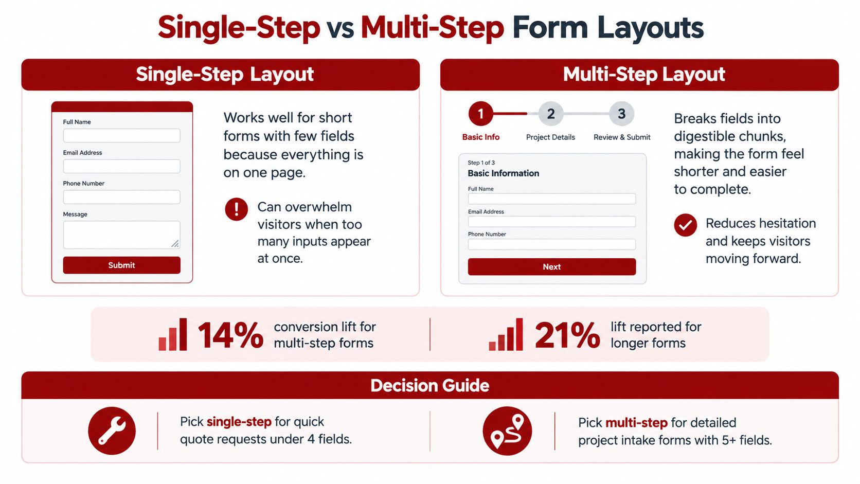
A Prescott homeowner who clicks a retargeting ad and already knows your company can usually handle a short, single-step form. A first-time visitor from a broad search may need more explanation and qualification before sharing contact details. The right layout depends on traffic temperature, offer complexity, and what your team must know before responding.
A single-step form displays every field at once. A multi-step form divides the interaction across smaller screens, often starting with a low-friction question such as service type or location.
One industry summary found that multi-step forms converted 14% better than equivalent single-page forms overall, with a 21% improvement for lead-generation forms specifically (MarketingCharts' form benchmark). Treat that as a testing direction, not a guarantee. A warm visitor may prefer speed, while cold traffic may respond better after answering an easy first question.
Use a single step for warm, simple requests
Choose a single-step layout for a direct service inquiry, short quote request, or returning visitor who already understands the offer. Keep the fields limited to what the office needs for the first response. Put the service, location, and preferred contact method on one screen when those details are enough to start the conversation.
This layout is especially effective when it fits comfortably on a phone without scrolling. Someone searching for a direct estimate should not need several clicks to request a callback.
Use multiple steps for cold traffic and real qualification
A multi-step form fits requests involving service area, timing, property details, or budget. Ask the easiest question first, then request contact information and deeper qualification after the visitor has made a small commitment. That sequence can reduce hesitation from unfamiliar visitors, provided each question helps route or prioritize the lead.
Do not use multiple screens to disguise an oversized form. Unnecessary questions still create friction, even when spread across several clicks. Show progress, order questions logically, and make the post-submission outcome clear.
Review a focused landing page service for examples of how page context can support the form, rather than treating the form as a separate component.
Writing the Copy, Headline, and Call to Action
A Prescott homeowner arriving from a broad social ad needs a different message from someone returning through a referral. Both may see the same form, but their confidence in the business is different. Copy should close that gap before the visitor reaches the first field.
Start with a headline that matches the search, ad, referral, or page that brought the visitor there. “Roofing Services” is a category label. “Request a Free Roof Inspection in Prescott” states the service, location, and available action. That specificity helps cold visitors confirm they are in the right place, while warm visitors can move quickly without rereading the page.
Use the supporting line to explain what happens next:
“Tell us what you need, and we'll confirm the next step by phone.”
“Share a few project details so we can route your request to the right specialist.”
“After you submit, we'll review the information and contact you about availability.”
Choose only an expectation the office can meet consistently. A precise, honest explanation builds more trust than a fast-response promise the business regularly misses. Cold traffic needs that clarity before sharing contact details. Warm traffic may need only a short reminder of the next step.
Replace generic buttons with outcome language
“Submit” describes the form software, not the result. Write the button around the action the visitor wants to take:
Local service offer: “Request Your Prescott Service Quote” with “Get My Free Estimate”
Price quote: “Find Out What Your Project May Require” with “Request My Pricing”
Consultation: “Talk Through Your Marketing Priorities” with “Book My Consultation”
The CTA should fit the visitor's confidence and the offer on the page. A referral visitor who already knows the business may be ready for “Book My Roof Inspection.” A first-time visitor from a broad social post may need “Get the Service Guide” or “Ask a Question” before agreeing to a sales conversation. Use the traffic-temperature section to set the appropriate form commitment, then make the button state that commitment plainly.
Keep one primary button visually dominant. Phone prompts, navigation links, and secondary offers can remain available, but they should not compete with the requested action above the fold. The button should also reflect the form's actual outcome. Do not promise a free estimate if the business first schedules an inspection or reviews project details.
Make errors helpful instead of hostile
Inline validation catches mistakes while the visitor is still working in the relevant field. A benchmark review reported that real-time validation lifted completion by 5% on short forms and by 11% to 13% on forms with six or more fields (Digital Applied's validation benchmarks).
Use calm, specific messages:
Good: “Please enter a valid email so we can send your estimate.”
Poor: “Error: invalid input.”
Good: “Enter a phone number with enough digits for a callback.”
Poor: “Required field.”
Place the message beside the field, preserve everything already entered, and identify the issue before the final click. A cold visitor has less patience for unexplained failure. A warm visitor may complete the form despite friction, but avoidable errors still reduce usable leads.
Build for a Prescott phone user
Local visitors often arrive on mobile. Stack the form cleanly, keep labels visible, enable autofill, use for phone numbers and for email addresses, and place the primary button where a thumb can reach it without awkward scrolling.
Use readable text, generous tap targets, and clear separation between fields. Test on a small screen with a slow connection and the keyboard open. Check that:
Fields stay visible: Labels and error text should not overlap the keyboard.
Input types work: The phone field should open a numeric-friendly keypad, while email should offer the appropriate keyboard.
The button remains clear: Visitors should know where to tap after the final field.
The thank-you state works: Confirm that the message, tracking, and next step appear after submission.
Matching Form Length to Traffic Temperature
The same form shouldn't serve every traffic source. A visitor who has just discovered a Prescott contractor through a broad social post has less trust and context than someone returning from an email or referral.
One industry summary placed cold-traffic lead forms at roughly 2% to 5% conversion, compared with 10% to 25% for warm traffic from email or retargeting (LeadSquared's lead capture guidance). That difference makes form length a traffic decision, not just a design preference.
Traffic Source | Temperature | Recommended Fields | Offer Type |
|---|---|---|---|
Broad social or display traffic | Cold | 2 to 3 | Guide, checklist, question, or low-commitment request |
Google Ads for a specific service | Higher intent | 3 to 5 initially | Quote request or service inquiry |
Email, referral, or retargeting | Warm | More qualification when justified | Consultation, inspection, or project intake |
Don't ask a cold visitor for a project budget before explaining who you are and what happens next. Start with service, name, and a contact method, then use the follow-up conversation to qualify.
Google Ads traffic still varies. Someone searching for “roof repair Prescott” has stronger intent than someone clicking a general home-improvement ad, but the page must deliver the exact service promised in the query. Dedicated landing pages and conditional logic let you show a shorter form to cold visitors and a more detailed version to returning or high-intent users.
Email and referral visitors can handle more specific questions because the referring context has already done part of the trust-building work. Even then, ask only for information that changes the next action.
Trust Signals, Privacy, and Consent That Reduce Hesitation
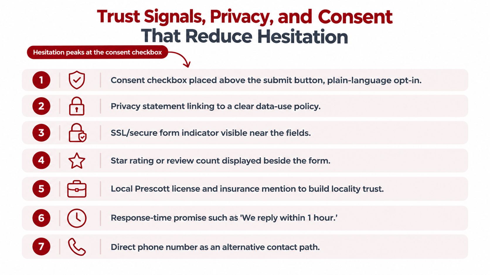
Trust signals matter most near the point where a visitor decides whether to share a phone number, email address, or project details. A local business should make its identity and data use easy to understand before the visitor clicks.
Useful reassurance can include a local address, licensing or insurance information when accurate, relevant reviews, a direct phone number, and a short explanation of what happens after submission. Don't add badges just because they look official. Each signal should answer a real concern.
A privacy line can be concise:
“We use your details to respond to this request. We don't sell your information or add you to marketing messages without permission.”
The wording must match the business's actual practices. GDPR-style guidance recommends structured consent records for each submission, and independent research has raised concerns about purchased leads containing fabricated or sensitive information and triggering unwanted contact (research on lead-generation websites and data practices). Even when a Prescott business isn't serving a GDPR-covered audience, clear consent and careful data handling protect trust and improve lead quality.
Separate notice from permission
A privacy notice explains what data is collected and why. Consent asks whether the person agrees to a specific optional use, such as marketing email or text messages. Keep optional marketing consent separate from the request itself, and don't pre-check an optional box.
A bare line such as “I agree to the terms” gives the visitor little context. A clearer version labels the action and connects it to the relevant policy:
Weak: “By submitting, you agree.”
Strong: “I agree to be contacted about this request. See our Privacy Policy for how we use submitted information.”
Optional marketing: “Yes, send me occasional service updates. I can unsubscribe at any time.”
Place the privacy policy directly below the form and use recognized security indicators only when they accurately describe the page. Guidance on lead-generation forms also recommends visible privacy policies, security badges, and explicit consent or separate marketing checkboxes (Monday's lead generation form guidance).
Connect the form to the follow-up system
A submission should enter the CRM automatically through a native integration or webhook. Map the service type, location, source, consent status, and contact details into fields that the office can use. HubSpot and Pipedrive are examples of CRM platforms that can receive this data, but the correct choice depends on the business's current workflow.
Send a tagged confirmation email after submission, then route the inquiry to the correct inbox or sales queue. For Google Ads, place a conversion tag on the thank-you page and create a separate qualified-lead event when the inquiry meets the business's definition of a real opportunity. Use a standard conversion when every completed form has similar value. Use value-based tracking when service type or qualification creates meaningful differences in business value.
Form conversion rate and completion rate measure different problems. Form conversion rate is , while completion rate is (WPForms' form conversion guide).
Pull these figures weekly:
Form views
Form starts
Completed submissions
Qualified submissions
Booked appointments or sales handoffs
A sudden change in completion rate points toward friction during the interaction. A stable completion rate with fewer qualified leads may indicate a traffic, offer, routing, or targeting problem.
For Prescott and Northern Arizona businesses, a clear contact process should make both the customer's next step and the internal response path obvious.
Three Lead Generation Form Templates You Can Copy Today
The fastest improvements usually come from four changes: reduce the first interaction to three to five fields, replace generic CTA text with an outcome, add inline validation, and match the form to traffic temperature. Don't rebuild the entire website before testing those decisions.
Template one for a Prescott roofing quote
Use a four-field single-step form for cold Google Search traffic promoting an on-site quote.
Name
Phone
Service needed
ZIP code
Headline: Request Your Prescott Roof QuoteSubhead: “Tell us what you need, and we'll review your request before contacting you about the next step.”Button: Get My Free EstimateTrust line: “Your information is used to respond to this request and isn't sold.”
The service field can use options such as repair, replacement, inspection, or storm damage. ZIP code belongs here because service coverage affects whether the request can be accepted. Don't ask for budget before the visitor has received enough context to trust the business.
Template two for a strategy consultation
Use a five-field single-step form when the offer is a 30-minute consultation and the visitor has arrived from a focused service page, referral, or retargeting campaign.
Name
Work email
Phone
Primary marketing challenge
Preferred timeframe
Headline: Talk Through Your Lead FlowSubhead: “Share the issue you want to address, and we'll use that context to make the conversation useful.”Button: Book My ConsultationTrust line: “Your details stay with the team handling your request.”
The fourth field can be a short selection rather than a large text box. Options might include website conversions, Google Ads, SEO, or local visibility. The timeframe question helps the team prioritize without demanding a budget before the conversation begins.
Template three for a warm demo request
Use a seven-field, two-step form only when visitors already understand the service and arrive on a dedicated demo page.
Step one
Name
Work email
Company name
Phone
Step two
Service or product interest
Team or business size
Main goal for the demo
Headline: See How the Platform Fits Your WorkflowSubhead: “Answer a few questions so the demonstration can focus on your priorities.”Button: Book My DemoTrust line: “We use these details to prepare the demonstration and follow up about your request.”
The order begins with identity and contact information, then moves into qualification after the visitor has started. That structure makes sense for warm traffic, but it would be excessive for a first-touch local service inquiry.
Template | Field Count | Key Fields | Headline | Button Text | Layout |
|---|---|---|---|---|---|
Prescott roofing quote | 4 | Name, phone, service, ZIP code | Request Your Prescott Roof Quote | Get My Free Estimate | Single-step |
Strategy consultation | 5 | Name, email, phone, challenge, timeframe | Talk Through Your Lead Flow | Book My Consultation | Single-step |
Warm demo request | 7 | Contact, company, interest, size, goal | See How the Platform Fits Your Workflow | Book My Demo | Two-step |
Start with the template closest to your current offer, then compare views, starts, completed submissions, and qualified handoffs. A form-focused website design service can be useful when the page structure, form logic, and tracking need to work together, but a targeted field or CTA change often deserves testing before a full rebuild.
A practical 30-day rollout is straightforward. In week one, audit the existing form and its routing. In week two, publish the shorter version. In week three, separate CTA or form versions by channel. In week four, review submission and completion data, then decide which field or layout deserves the next test.
Silva Marketing helps Prescott and Northern Arizona businesses improve websites, landing pages, Google Ads, SEO, and lead generation forms so inquiries are easier to submit, route, and measure. Visit Silva Marketing to request a no-pressure form review and identify the most practical change for your current lead flow.
Comments