
What Makes a Good Business Logo That Lasts

A Prescott contractor can have excellent work, fair pricing, and strong reviews, yet still look disorganized when the logo on the truck differs from the logo on the invoice and Google Business Profile. Customers often form an impression from the mark before they read a service description, compare a price, or open a review.
A good business logo solves that problem by making the company recognizable wherever customers encounter it. Silva Marketing helps local service businesses, professional firms, contractors, and growing companies in Prescott, Prescott Valley, Chino Valley, and across Northern Arizona create identities that stay clear across websites, Google listings, trucks, uniforms, invoices, signs, and social profiles.
Table of Contents
Why Your Logo Is the First Thing Customers Judge - Recognition happens through repetition - Use production checkpoints, not just design opinions
Simplicity and Memorability as the Starting Point - Build around one primary cue - Repeat the mark everywhere
Scalability Across Every Place Your Logo Appears - Match each version to the surface - Work from vector masters
Color, Typography, and the Meaning Behind the Mark - Let geometry carry part of the message
When Simple Becomes Generic and How to Avoid It - Preserve one ownable feature
Accessibility, Contrast, and Real-World Legibility - Test the actual use case
Hiring a Designer or Designing It Yourself the Right Way - Ask for the files that keep the identity usable
Logo Questions Local Business Owners Ask Most - How long does a good logo process take? - What should a local service business budget? - How many concepts should a designer show? - What should I do with an outdated logo? - How do I protect the mark? - How should the logo connect to Google Business Profile and social profiles? - Can a logo make a trust claim?
Why Your Logo Is the First Thing Customers Judge
A Prescott service-business owner may notice the problem while preparing a quote at the kitchen table. The contractor invoice carries one mark, the job estimate uses another, and the Google search result on the laptop shows a cramped version that customers can barely identify. None of those assets is necessarily terrible by itself, but together they make the company feel less established.
The core answer to what makes a good business logo is practical: it should remain recognizable before a customer reads a word. The mark needs to hold its identity on a truck door, a uniform, a mobile screen, a printed invoice, a social avatar, and a Google Business Profile thumbnail. A logo that only looks impressive in a presentation mockup hasn't finished its job.
Recognition happens through repetition
Customers build familiarity through small, repeated impressions. Someone may see a service vehicle near a Prescott neighborhood, notice the same symbol on a technician's shirt, then encounter it again beside a local search result. Consistent use helps those separate moments feel connected.
That is why a logo supports sales in the background. It doesn't replace proof, reviews, licensing, or a clear service offer. It makes those signals easier to associate with the same business. A useful overview of how repeated brand exposure supports awareness is available in Silva Marketing's guide to marketing and brand awareness.
Use production checkpoints, not just design opinions
A working logo should pass six tests:
Recognition: Can a customer identify the main visual idea quickly?
Distinctiveness: Does it avoid blending into nearby competitors?
Scalability: Does it work on tiny digital surfaces and large physical applications?
Legibility: Can people read the name without effort?
Reproduction: Does it survive one-color printing, embroidery, vinyl, and photocopying?
Consistency: Can the business use the same identity across every customer touchpoint?
These aren't design-school abstractions. They're the checkpoints we use when evaluating whether a mark will perform for a contractor, retailer, clinic, restaurant, or professional firm serving Prescott and Northern Arizona.
Simplicity and Memorability as the Starting Point
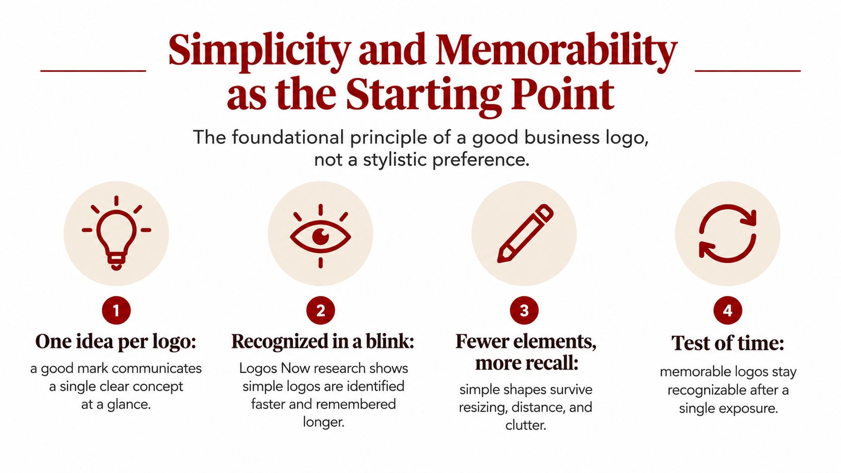
Simplicity is the foundation of memorability, not a passing visual style. The 2024 “Logos Now” study surveyed 3,000 respondents in the United States and the United Kingdom and asked them to evaluate logos from more than 100 major global brands. Among the qualities associated with memorable marks, “simple” was the strongest descriptor, ahead of being widely seen, distinctive, branded with a name, or built around a recognizable shape or color. Read the Logos Now research.
For a Prescott service business, that means one clear idea should lead. A roofline, tool shape, regional reference, custom letterform, or carefully constructed symbol can work. Several competing illustrations, fine textures, tiny lines, and decorative effects usually create trouble when the mark becomes a vehicle decal, embroidered patch, or small digital icon.
Build around one primary cue
Start with a primary symbol or wordmark. Keep the number of visual ideas limited, then remove details that disappear when the mark is reduced or viewed from a distance. A strong logo doesn't need to explain the entire company in one image. Its job is to create a recognizable visual handle that the rest of the brand experience can reinforce.
The research on repeated exposure adds an important qualification. Experiments involving 68 unfamiliar-logo observations and 164 familiar-logo observations found that repeated exposure improves recognition and brand attitudes. Simple logos offered short-term advantages, while more complex logos could gain benefits over longer exposure periods. Review the logo exposure research.
That doesn't mean complexity is automatically wrong. It means every complex feature needs a purpose. A distinctive negative space shape may survive and aid recognition. A thin decorative border probably won't.
Repeat the mark everywhere
Test the simplified concept on a yard sign, invoice, work shirt, social avatar, mobile header, and local listing. If the mark needs an explanation each time, simplify the visual idea. Silva Marketing's practical guide to creating a brand identity can help owners connect the logo to the broader identity system.
Practical rule: Remove detail that disappears, but preserve the feature customers can own in their memory.
Scalability Across Every Place Your Logo Appears
A logo that looks sharp on a desktop mockup can fail on a service truck, invoice, favicon, or Google Business Profile thumbnail. In Prescott and across Northern Arizona, customers may see the mark at full size on a vehicle wrap, then encounter it as a tiny profile image or embroidered uniform detail. Scalability is a production requirement tied directly to recognition.
Build a small family of related assets instead of forcing one locked image into every placement. The full version can carry the business name and descriptor. A compact symbol can identify the company in square spaces, while a one-color version handles applications where color is unavailable.
Match each version to the surface
Logo Version | Primary Use |
|---|---|
Full-color primary mark | Website headers, proposals, presentations, and prominent digital placements |
Horizontal lockup | Website navigation, invoices, email signatures, and banners |
Compact symbol | Social avatars, profile images, vehicle details, and small square spaces |
One-color version | Stamps, photocopies, engraving, embroidery, and low-cost print |
Reversed version | Dark backgrounds, vehicle windows, uniforms, and signage |
Minimum size depends on the lettering, symbol, material, and viewing distance. Set that limit through physical and digital tests, not a desktop preview. Clear space matters as well. Phone numbers, buttons, and nearby marks can crowd the logo and weaken its visual authority.
Email signatures show how quickly space becomes limited. The email signature image pixel guide provides useful implementation context, including considerations for keeping the mark clean beside functional information. The same discipline applies to invoices, browser tabs, and Google Business Profile imagery.
Work from vector masters
A vector master keeps edges sharp as the logo grows or shrinks. Request source artwork plus exports for web, print, dark backgrounds, and one-color use. A raster-only file may appear acceptable in a browser but fail when a sign vendor, printer, or embroidery shop needs to reproduce it.
Production method should shape the design before approval. Small lettering, thin strokes, and tight spacing often need adjustment before the artwork goes to an embroidery shop. Review those details on the actual intended material, not only on screen.
A compact logo application demonstrates why a reduced mark needs its own role. For a Northern Arizona service company, the symbol should remain identifiable on a favicon and profile thumbnail, while the full lockup carries more information on a truck or storefront. Each version should point back to one recognizable brand.
Color, Typography, and the Meaning Behind the Mark
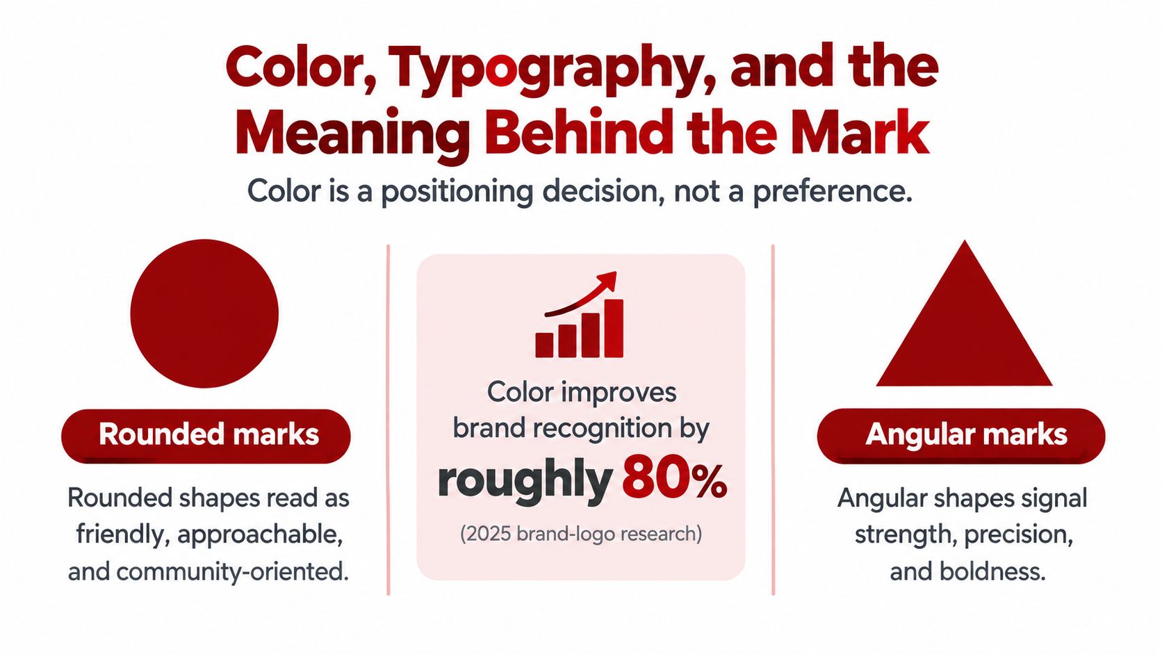
Color should support positioning, not substitute for it. A 2025 review of 217 articles on brand-logo research found that logos play a central role in communicating company identity and supporting recall. Separate experimental work found that concrete logos and grayscale versions were recognized more accurately, while color effects varied. Greater use of red was negatively associated with recognition and liking, while blue and green were positively associated with both outcomes. See the brand-logo research review.
That finding doesn't establish one universal winning color. It supports a more useful rule. Build a recognizable symbol or wordmark first, then select a restrained palette that supports the intended position. A deep green and slate combination may suit a groundskeeping business that wants to communicate steadiness and growth. Navy and copper can fit a trade company seeking a grounded, crafted feel. Warm terracotta may support a hospitality business connected to the regional area.
Let geometry carry part of the message
Rounded shapes often feel more approachable, while angular forms can suggest precision, strength, or structure. Those associations are not a substitute for customer research, but they give the designer a useful starting point. A pediatric practice, community organization, or family-owned service company may need a softer visual language than an engineering firm or commercial contractor.
Typography carries the brand when the icon is absent. A wordmark must remain readable on a truck, estimate, website header, and search thumbnail. Pay attention to letter spacing, the height of lowercase letters, the openness of counters inside letters, and the difference between a font that looks attractive at presentation size and one that remains clear in use.
Two complementary weights are often easier to manage than a crowded system of type treatments. Avoid narrow letterforms, elaborate scripts, and effects that collapse when the name is reduced or reproduced in one color.
Before approving the final files, view the logo in pure black, pure white, grayscale, and the chosen palette. If it only works in the color presentation, the underlying mark needs more work.
For businesses comparing local approaches, logo design services in Phoenix provide another reference point for evaluating how strategy, typography, color, and production requirements fit together.
When Simple Becomes Generic and How to Avoid It
Minimalism can improve recognition, but it can also erase the feature that makes a small business distinguishable. Recent research found that 90.57% of surveyed consumers supported minimalist logo design, while 70.48% identified recognizability as the most important success factor. Separate 2025 consumer research found bright, bold branding was called interesting by 57% of respondents, compared with 33% for minimalism, while minimal branding was more than twice as likely to be called uninspiring. Review the research on minimalism and recognizability.
The practical trade-off isn't minimalism versus complexity. It's recognizability versus generic sameness. A plain blue wordmark with a standard sans-serif font may look clean, but it gives customers little to remember if every competitor in the category uses the same approach.
Preserve one ownable feature
A simplified mark might use a custom letter construction, an unusual negative-space shape, a signature color relationship, or a regional reference tied to Northern Arizona. A generic mark might use a stock roof, leaf, wrench, or mountain icon with no distinctive treatment.
Run three tests before approval:
Thumbnail test: Reduce the mark until it is small on a phone or local search result. Does the main cue remain?
Category test: Place it beside nearby competitors. Could another contractor plausibly use the same symbol and typography?
Five-year test: Does it express the business, or does it depend on a short-lived visual trend?
For a quick Prescott audit, collect the logos of nearby competitors from search results, trucks, signs, and social profiles. Arrange them on one page, remove the business names, and ask someone unfamiliar with the companies which marks they can distinguish. The mark that looks cleanest isn't automatically the strongest. The one that remains identifiable and differentiated deserves closer attention.
Accessibility, Contrast, and Real-World Legibility
Accessibility exposes weak logo decisions early. A mark that depends on subtle color differences may fail on an invoice, a sun-faded vehicle door, a low-quality social image, or a sign viewed in harsh outdoor light.
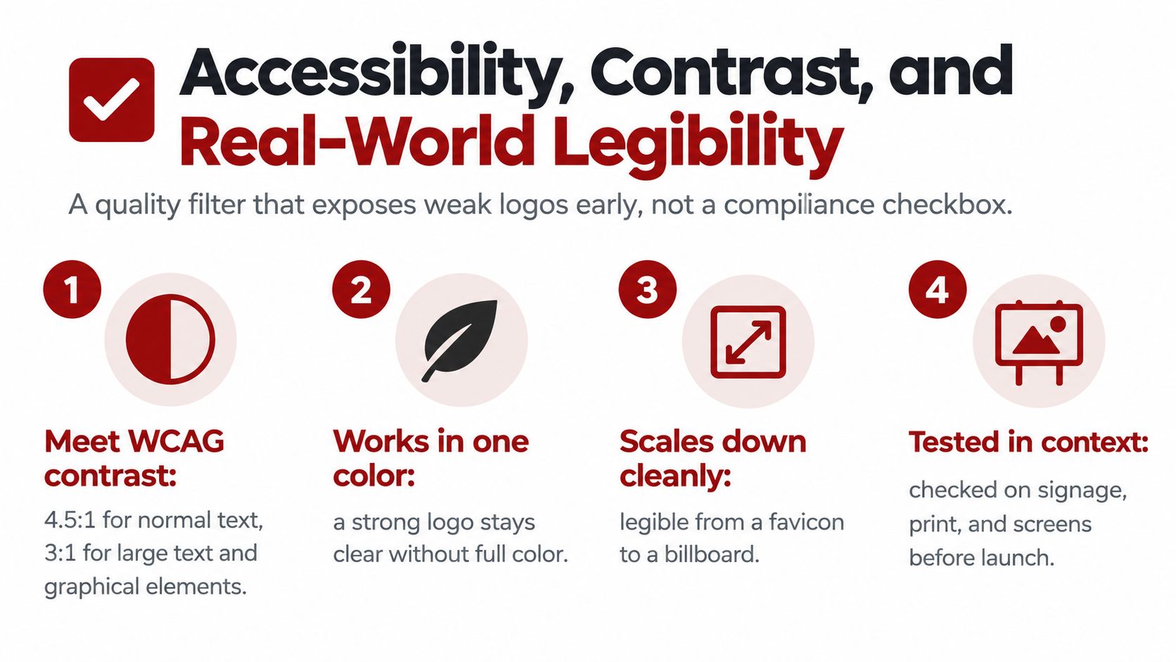
WCAG sets a 4.5:1 contrast ratio for ordinary text and 3:1 for large text, while logo and brand-name text is exempt from those minimum requirements. The exemption doesn't make faint logo lettering effective. It recognizes that corporate identity systems may control brand colors, while W3C still recommends a sufficient-contrast variant when the system allows one. Review W3C's contrast guidance.
Color choice also needs to account for color-vision differences. Red-green color-vision deficiency affects approximately 8% of men and 0.5% of women, according to the cited accessibility background. A logo shouldn't rely on color alone to distinguish two services, separate parts of a symbol, or communicate meaning.
Test the actual use case
Use this short production checklist:
Contrast testing: Check the logo against light, dark, textured, and branded backgrounds.
Colorblind simulation: Confirm that shape, spacing, and typography still separate the important elements.
Grayscale review: Print and view the mark without color.
Substrate proof: Test it on the actual paper, vinyl, fabric, metal, or painted surface.
Small-size review: Confirm that lettering and counters remain open at the smallest approved application.
W3C's design guidance also distinguishes the logo itself from its surrounding interface. A logo may be exempt from a contrast minimum, but navigation text, buttons, and other nearby content still need to remain usable. Read W3C's guidance for designing for accessibility.
Hiring a Designer or Designing It Yourself the Right Way
A logo that looks good on a screen can still fail on a Prescott service truck, a favicon, an invoice, or a Google Business Profile thumbnail. Choose the production path based on where the mark must work, who will use it, and how much brand direction the business needs.
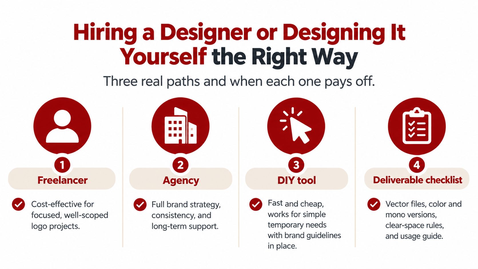
A Prescott freelancer suits a focused project with a clear brief and a defined set of applications. An agency is a better fit when the logo must connect with a website, search strategy, signage, messaging, and a broader brand system. A DIY tool can serve a temporary or simple identity, if the owner accepts its limits and keeps usable files organized.
The business problem should guide the choice. An owner who knows the audience, competitors, services, and required applications may get an efficient result from a focused designer. A company with inconsistent materials across locations, or a website redesign ahead, usually needs more planning around the brand and its production needs than a quick template can provide.
Ask for the files that keep the identity usable
A proper handoff should include:
Vector masters: AI, EPS, or SVG source files.
Transparent exports: PNG files for everyday digital use.
Application versions: Full-color, one-color, reversed, compact, and horizontal versions.
Usage guidance: Clear space, minimum reproduction size, approved colors, and background rules.
Font information: Licensing details or outlined production files where appropriate.
A JPG-only delivery creates problems when a sign vendor, printer, or embroiderer needs a different format. Also question work based on a generic template or a process that never addresses customers, competitors, and actual applications. A polished preview cannot replace production assets.
Embroidery needs its own review because thread behaves differently from ink or pixels. The Dirt Cheap Headwear digitizing guide explains why small text, thin strokes, and tight spacing may need adjustment before production.
Before design begins, a local business can book a brand strategy session with Silva Marketing to define applications, audience, deliverables, timeline, and budget. That preparation keeps the project focused, whether the final designer is a freelancer, an agency, or an internal team.
Logo Questions Local Business Owners Ask Most
How long does a good logo process take?
The process depends on the clarity of the brief, the number of decision-makers, the research required, and the production applications. A thoughtful project includes discovery, concept development, revision, testing, and final file preparation rather than stopping at the first attractive sketch.
What should a local service business budget?
There isn't one fair price for every logo. Scope matters more than a headline figure. Compare the number of concepts, revision rounds, strategy work, production versions, source files, usage guidance, and ownership terms before comparing quotes.
How many concepts should a designer show?
More concepts don't automatically create a better result. A focused set of strategically different directions usually produces a clearer decision than a large gallery of minor variations.
What should I do with an outdated logo?
Keep the recognizable equity if customers already associate it with the business, then identify what fails in current use. A careful refinement may improve typography, spacing, color, or scalability without discarding the identity people already know.
How do I protect the mark?
Keep dated source files, document the design process, and discuss trademark research with a qualified legal professional. A logo should be original, and it shouldn't imitate a competitor closely enough to create confusion.
How should the logo connect to Google Business Profile and social profiles?
Use the same approved mark and consistent color treatment across the profile image, website, social accounts, invoices, uniforms, and vehicles. Prepare a compact version for square spaces so the business remains identifiable instead of forcing a wide logo into a tiny frame.
Can a logo make a trust claim?
A logo can support a real brand promise, but it can't prove an unsupported reputation. The Federal Trade Commission's endorsement guidance explains that endorsements must reflect honest opinions or experiences, and material relationships need clear disclosure.
Silva Marketing offers a no-pressure audit of an existing logo for Prescott-area businesses that aren't sure whether their current identity is helping or holding them back. The review focuses on recognition, consistency, accessibility, and surfaces where customers encounter the brand.
Silva Marketing helps Prescott and Northern Arizona businesses plan and produce distinctive logo systems that work across websites, Google Business Profiles, vehicles, uniforms, invoices, and signage. Visit Silva Marketing to request a practical logo consultation and discuss the next step for your brand.
Comments