
UX Website Redesign Guide for Prescott Businesses

A roofer in Prescott, a dentist in Prescott Valley, an HVAC contractor in Chino Valley, or an attorney serving Northern Arizona can have a polished website and still lose calls. The problem is often not the logo, color palette, or photography. Visitors may not understand the offer quickly, find the right service page, trust the business enough to contact it, or complete a form comfortably on a phone.
Silva Marketing helps local service businesses turn that uncertainty into a clearer path from search visit to phone call or qualified lead. Its Prescott-focused work covers custom website redesign, search engine optimization, Google Ads, technical improvements, content strategy, and conversion-focused user experience for businesses throughout Prescott and the surrounding Quad City region.
A successful UX website redesign is a measurable revenue program, not a visual refresh. This guide follows the sequence that protects lead volume: baseline research, information architecture, wireframes, performance, accessibility, controlled launch, and post-launch measurement. The objective is straightforward, make the next visitor's path shorter, faster, and more obvious, rather than designing a site that merely looks current.
Table of Contents
Why Prescott Service Businesses Redesign for UX First - What cosmetic redesigns miss
Baseline Research That Reveals Real Friction - Combine behavioral and human evidence - Turn observations into a scorecard
From Research to Information Architecture and Wireframes - Build the essential paths first - Test one journey before visual polish
Designing for Speed, Trust, and Mobile Visitors - Treat performance as part of the design - Make accessibility practical
User Testing and a Controlled Launch - Validate the technical handoff - Use a launch-day sequence
Tracking KPIs, Local SEO, and the Road to More Calls - Separate business outcomes from supporting signals - Build local SEO into the new structure
Why Prescott Service Businesses Redesign for UX First
A modern-looking website can still create practical problems. The phone number may be difficult to tap, the emergency service may be buried in navigation, or the homepage may describe the company without explaining what a visitor should do next. In a local market, those details matter because a prospect often arrives with a specific need and limited patience.
Research from the Nielsen Norman Group's web usability reports found that users read at most 28% of the words on an average web page during an average visit, while 20% is more likely. The group also reports that many users leave within 10–20 seconds when the value proposition isn't clear, unless the page communicates its relevance within the first 10 seconds. Those findings make UX a business concern. A redesign must compress clarity, navigation, and trust into a small attention window.
What cosmetic redesigns miss
A cosmetic refresh changes appearance while leaving the underlying journey intact. It may introduce fashionable gradients, animations, or a larger hero image, but it won't solve a confusing service menu or a contact form that asks for unnecessary information.
An effective redesign ties each change to a behavior:
Clearer headline: Help visitors identify the service and location immediately.
Stronger service navigation: Help a search visitor reach the relevant money page without guessing.
Visible phone action: Make calling or requesting an estimate easy on mobile.
Useful trust evidence: Give prospects reasons to believe the business can solve their specific problem.
Shorter forms: Remove fields that delay contact without improving lead qualification.
Practical rule: If a design decision can't be connected to a user action or a business metric, it's probably decoration rather than UX strategy.
Research summaries cited by Blacksmith Agency's web design statistics report that well-designed interfaces can raise conversion rates by 200% to 400%, while allocating about 10% of a development budget to UX has been associated with an 83% conversion uplift. These are industry benchmarks, not a promise for every Prescott business. They do support a disciplined approach, baseline the existing experience, identify friction, test alternatives, and attribute changes to outcomes.
A useful redesign process doesn't gamble on lead volume during a rebuild. It preserves important URLs, validates tracking, stages changes, and measures calls and forms against the original site. Silva Marketing also outlines the role of structure and conversion clarity in service business website design, which is especially relevant when a local company depends on phone-driven demand.
Baseline Research That Reveals Real Friction
Research should begin with a baseline, not a mood board. Before anyone draws a new screen, document how the current website performs across the journeys that create revenue. The point isn't to collect an impressive analytics report. It's to identify where a real customer hesitates, abandons, or takes a longer route than necessary.
Start with the business's highest-value entry points. Review top landing pages, mobile and desktop behavior, scroll depth, form abandonment, call-tracking tap rates, and interactions with the Google Business Profile. Separate informational traffic from visitors who arrive on service pages with an immediate need. A page with fewer visits may deserve priority if it contributes more calls or qualified forms.
Combine behavioral and human evidence
Analytics show what happened. They don't always explain why. Add a small qualitative layer by reviewing five to eight recorded session replays, conducting two short user tests with real customers, and interviewing someone on the sales team about questions prospects ask before they convert.
Look for specific friction:
Does a visitor understand the service offered in Prescott or nearby communities?
Can a mobile user find the phone number without opening several menus?
Does the form explain what happens after submission?
Are service areas clear enough to prevent an unqualified inquiry?
Do reviews, licenses, guarantees, or project photos appear where confidence is needed?
Compare the site with two Prescott competitors and one out-of-region benchmark. Don't copy their branding. Study their information hierarchy, service-page patterns, proof placement, calls to action, and answers to common objections. The comparison should reveal patterns worth borrowing and gaps Silva Marketing's clients can own through clearer content and stronger local relevance.
Turn observations into a scorecard
The final output should be a ranked list of journeys, not a presentation full of screenshots. Attach a baseline metric to each journey so the team can judge whether the redesign solved a business problem.
Research Input | Decision It Informs |
|---|---|
Top entry pages | Which landing pages need clearer first-screen messaging |
Mobile behavior | Which layouts, controls, and phone actions need priority |
Scroll depth | Where important proof or calls to action are being missed |
Form abandonment | Which fields, instructions, or steps create friction |
Call-tracking taps | Whether phone actions are visible and usable |
Google Business Profile interactions | How local discovery connects to website behavior |
Session replays and user tests | Which moments cause confusion or hesitation |
Sales-team interview | Which objections and questions need direct answers |
Competitor comparison | Which patterns to adopt and which gaps to differentiate |
Technical issues belong in the same baseline. A technical SEO audit checklist can help uncover crawl problems, indexation concerns, broken links, metadata gaps, and performance obstacles before the redesign changes the site's structure.
From Research to Information Architecture and Wireframes
Information architecture turns the friction list into a usable map. It answers a simple question: Can a Prescott visitor reach the right answer without understanding how the business is organized internally? If the answer is no, visual design won't rescue the experience.
Group services and search intent into clusters that reflect how customers ask for help. A contractor may need separate paths for service, problem, and location. A dental practice may organize around procedures and patient concerns. A law firm may need distinct pages for practice areas and communities served. Validate the proposed cluster map with a quick card sort involving three to five customers so internal assumptions don't control the navigation.
Build the essential paths first
Translate the highest-friction journeys into low-fidelity wireframes. Begin with the homepage, the top three service pages, the contact page, and the mobile call path. Keep these layouts deliberately plain. At this stage, stakeholders should debate sequence, wording, page relationships, and conversion actions, not colors or decorative details.
Annotate every major element. A phone button should identify the call-tap baseline it is intended to improve. A service-area block should connect to the service-area lookup problem. A review section should explain which trust objection it addresses. Those notes make the wireframe a working hypothesis rather than a collection of boxes.
A clear structure often includes:
Opening value proposition: State the service, location, and next action.
Service explanation: Answer the immediate question in plain language.
Proof: Show relevant experience, reviews, credentials, guarantees, or completed work.
Process details: Explain what happens after a call or form submission.
Service-area clarity: Identify Prescott, Prescott Valley, Chino Valley, and other covered communities where appropriate.
Conversion action: Offer a visible phone or form path without forcing visitors to search.
Test one journey before visual polish
Promote one priority service journey into an interactive prototype. Test the sequence from search landing page through service understanding, trust evaluation, and contact action. A prototype is inexpensive to change compared with coded templates, so disagreements about structure belong here.
The site structure guidance for SEO reinforces why page relationships matter beyond usability. A logical architecture helps users move through the site while giving search engines clearer topical and geographic signals. Keep the structure useful to people first. A city page or service page should exist because it answers a distinct customer need, not because a keyword was inserted into a URL.
Designing for Speed, Trust, and Mobile Visitors
Visual design should make the UX commitments visible, not undermine them. For a Prescott service business, that means pairing credible local proof with a fast, accessible mobile experience. The best-looking page loses value if a visitor can't interact with it quickly or read its text comfortably.
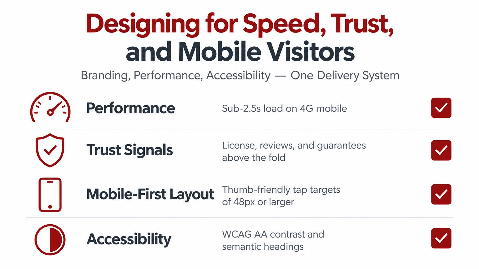
Use real photographs of crews, vehicles, completed jobs, and recognizable Quad City neighborhoods when available. Generic stock photography can make a local provider feel interchangeable. Put relevant trust evidence near the decision point, such as license information, reviews, guarantees, service experience, or clear ownership details. Use brand colors with WCAG AA contrast, choose typography that supports one-thumb reading, and keep a tap-to-call action visible on service pages.
Treat performance as part of the design
Set explicit Core Web Vitals requirements before development. A practical target is LCP under 2.5s, INP under 200ms, and CLS under 0.1, tested on a throttled Moto G simulation. Use lazy loading for below-the-fold images, compress hero video, choose system or self-hosted fonts with , and inline critical CSS so essential content isn't delayed by render-blocking assets.
The Core Web Vitals optimization guidance from Silva Marketing provides a useful technical reference for this work. Page speed isn't merely a developer concern. Ploy's redesign performance benchmarks report that a 1-second delay can reduce conversions by 7%, while sites loading under 2.5 seconds can produce 24% more conversions and 32% fewer bounces. These figures are benchmarks, so measure the actual Prescott site rather than assuming the same outcome.
Google's research adds another reason to protect small performance gains. Its Milliseconds Make Millions report associates a 0.1-second improvement with average conversion lifts of 8% for retail and 10% for travel sites. Those categories don't map directly to every contractor or professional practice, but they demonstrate why speed deserves a place in the conversion plan.
Make accessibility practical
Accessibility improvements often improve usability for everyone. Add descriptive alt text to project photos, visible focus states, skip-to-content links, properly labeled form fields, and captions for video. Use semantic headings and ensure controls remain understandable to screen-reader users and older homeowners.
MDN's mobile accessibility guidance emphasizes accessible controls, minimal typing, responsive design, and smaller image payloads. Design for the smallest screen first, then expand when the content needs a breakpoint, following web.dev's responsive design basics. That sequence prevents desktop layouts from dictating a cramped phone experience.
User Testing and a Controlled Launch
A redesign launch should have verification gates, not a single dramatic reveal. A Prescott service business can't afford silent phones because a form script failed, a redirect was missed, or a new mobile menu hides the emergency number.
Test the Figma prototype with 5 to 7 participants drawn from past customers and target ZIP codes in Prescott, Prescott Valley, and Chino Valley. Ask them to complete the three jobs that matter most: request a quote, find an emergency line, and confirm service-area coverage. Record task completion, time on task, and confusion signals, then fix the top three problems before code ships.
Validate the technical handoff
Move the site to staging behind a feature flag. For at least seven days, verify analytics, call tracking, form submissions, buttons, confirmation messages, and key page paths against the old site. A staging review should include realistic mobile devices, keyboard navigation, major browsers, and the forms staff use to qualify leads.
Use a launch-day sequence
Handle the release in a fixed order:
Review redirects: Check the 301 redirect map from the crawl side, especially for deleted or renamed service pages.
Request reindexing: Submit important changed URLs through Search Console.
Update the Google Business Profile: Confirm the website link points to the live experience.
Validate schema: Check structured data for errors and mismatched business details.
Check robots and sitemap files: Make sure search crawlers can access the intended pages.
Swap call tracking: Confirm numbers, source attribution, and tap-to-call links.
Test forms: Submit real test leads and verify delivery, notifications, and CRM handling.
Set rollback criteria before launch. A sustained drop in form submissions or a spike in 404 errors over 24 hours should trigger investigation and, if necessary, a revert to the previous version. The team should know who makes that decision, which evidence is required, and how the original site will be restored.
Tracking KPIs, Local SEO, and the Road to More Calls
Post-launch measurement should answer one question: did the new experience help qualified visitors take the next step? Compare every result with the baseline captured before development. A UX website redesign earns its place when it improves the actions a Prescott business depends on, including calls, qualified forms, booked appointments, and revenue per visitor.
Use two KPI layers. The first captures commercial outcomes. The second explains why those outcomes moved or failed to move.
Separate business outcomes from supporting signals
Top-line KPIs should include calls tracked with source attribution, qualified form leads, and booked appointments by service line. Supporting metrics should include organic clicks and impressions from Search Console, local pack visibility for priority searches, Google Business Profile calls and direction requests, bounce rate on service pages, and Core Web Vitals at the 75th percentile.
Speed deserves special attention on mobile. Google's Mobile Site Speed playbook reports that mobile pages loading one second faster saw up to a 27% increase in conversion rates. Treat that as a benchmark, not a guaranteed result, and connect speed data to actual forms and calls from Prescott-area visitors.
Metric | Pre-Launch Baseline | 30-Day Target | 60-Day Target | 90-Day Target |
|---|---|---|---|---|
Tracked calls | Record by source and service line | Meet or exceed baseline | Improve qualified-call mix | Sustain improvement |
Qualified forms | Record completion and quality | Protect volume during stabilization | Improve completion quality | Increase qualified submissions |
Booked appointments | Record by service | Confirm tracking accuracy | Identify stronger service paths | Improve booking consistency |
Organic clicks and impressions | Record priority pages | Watch for indexing changes | Compare page groups | Assess sustained search trend |
GBP calls and directions | Record profile actions | Confirm link and attribution | Compare with baseline | Identify local demand patterns |
Service-page bounce rate | Record by device and page | Detect regressions | Test page hierarchy or CTA | Keep reviewing high-value pages |
Core Web Vitals | Record field data at the 75th percentile | Fix launch regressions | Improve weak templates | Maintain technical quality |
Review performance at 30, 60, and 90 days, while accounting for normal seasonality in HVAC, roofing, plumbing, and related Northern Arizona services. Don't treat a single busy or quiet period as proof that the redesign worked. Look for consistent patterns across traffic sources, devices, service lines, and lead quality.
Build local SEO into the new structure
Each priority service and city page should have a distinct title tag and H1 that accurately describe its purpose. Keep the business name, address, and phone details consistent across the site and Google Business Profile. Add location-specific content that helps visitors understand coverage, conditions, neighborhoods, and service expectations without producing thin duplicate pages.
Internal links should connect useful educational content to money pages. A homeowner reading about roof maintenance, for example, should have a clear route to the relevant roofing service and contact action. This architecture supports discovery and usability at the same time.
Finish with a steady operating cadence:
Weekly review: Spend 30 minutes checking calls, forms, tracking errors, speed, and obvious behavior changes.
Monthly test queue: Prioritize headline, form, navigation, and call-to-action tests based on the largest remaining friction.
Quarterly deep dive: Combine user feedback with quantitative performance by service, device, location, and acquisition source.
A redesign isn't finished when the new homepage goes live. It becomes a durable asset when Silva Marketing, the business owner, and the service team keep learning from real customer behavior and improving the paths that generate qualified calls.
Silva Marketing offers UX-focused website redesign, SEO, Google Ads, and custom websites for Prescott and Northern Arizona businesses that need clearer journeys and stronger lead tracking. Visit Silva Marketing to review the available approach and discuss a measured next step for your site.
Comments