
How to Optimize Images for SEO: A Practical Guide

The HTTP Archive's 2022 Web Almanac found that images were the largest contributor to median page weight at approximately 1,026 KB on desktop pages and 811 KB on mobile pages. That's the core problem behind how to optimize images for SEO. Format, dimensions, and loading priority usually matter more than another keyword in alt text.
We at Silva Marketing help local service businesses in Prescott, Prescott Valley, and Chino Valley turn slow, image-heavy service pages into fast pages that earn calls. If you're a contractor, roofer, plumber, or other Northern Arizona business relying on project photos, this guide gives you the file sizes, attributes, and tests to use before you publish.
Table of Contents
Image Formats and Size Targets at a Glance - Why does image weight matter for local search
How to Compress and Export Images Step by Step - What is the correct order for exporting web images - What does a good export look like
Serve Responsive Images with srcset, Sizes and Dimensions - How do you set up responsive images
Alt Text, Filenames and Surrounding Copy - How should alt text change by image purpose - How do you audit filenames and nearby copy - How long should alt text be - Does every image need a keyword
Structured Data, Image Sitemaps and CDN Delivery - When do you need an image sitemap - When is ImageObject structured data worth adding - When does a CDN pay off
Measure Image Performance and Fix Common Problems - What should you measure before and after - Which fixes usually pay off first
Run Your Image SEO Checklist Before Publishing - What should you check on your platform - What is the final pre-publish checklist
Frequently Asked Questions About Image SEO - Does image file size affect Google rankings - Do I need WebP to rank in image search - Do I need an image sitemap - How long should alt text be
Image Formats and Size Targets at a Glance
Use WebP or AVIF for most photos, keep JPEG as a fallback, use SVG for logos and icons, and reserve PNG for graphics that need transparency or crisp text. That's the short answer for most local service sites.
Image type | Best format | Max display width | Target file size |
|---|---|---|---|
Hero or banner photo | WebP or AVIF, JPEG fallback | 1600 px | under 150 KB |
Project or gallery photo | WebP, JPEG fallback | 1200 px | under 100 KB |
Team or staff headshot | WebP, JPEG fallback | 600 px | under 60 KB |
Logo or icon | SVG | vector, no fixed width | under 10 KB |
Screenshot or diagram with text | PNG or lossless WebP | 1200 px | under 200 KB |
Map or chart | PNG or SVG | 800 px | under 100 KB |
Treat these as starting targets, not fixed rules. A hero photo on a Prescott roofing page may need about 1600 px for high-resolution screens, while a headshot displayed in a small card needs far less. Match the file to the space it fills.
The scale explains why this matters. According to HTTP Archive's Web Almanac, in 2024 the median total image weight was 900 KB on mobile pages and 1,054 KB on desktop pages. One oversized photo can therefore become a large share of what a phone visitor downloads.
Why does image weight matter for local search
Many customers in Prescott Valley and Chino Valley look up a contractor on a phone while standing in a driveway on a cellular connection. A hero photo on a Prescott Valley plumbing page loads at the same weight for a visitor in Chino Valley as for one in Prescott. One oversized file costs every visitor the same wait, and some won't wait to call.
Practical rule: If a single photo is larger than the target for its slot, resize it before you touch anything else.
Check a page by opening it at phone width, counting the images, and adding up their sizes in browser developer tools. Compare each file against the table. Product-focused sites face the same trade-off, which is why resources on how to improve SEO for mattress product images also start with format and size discipline.
Keep WebP as your default. Offer AVIF only where your encoding pipeline and CDN support it well, and always keep a JPEG fallback for older browsers. Format alone won't rescue a file that's twice as wide as its display slot.
How to Compress and Export Images Step by Step
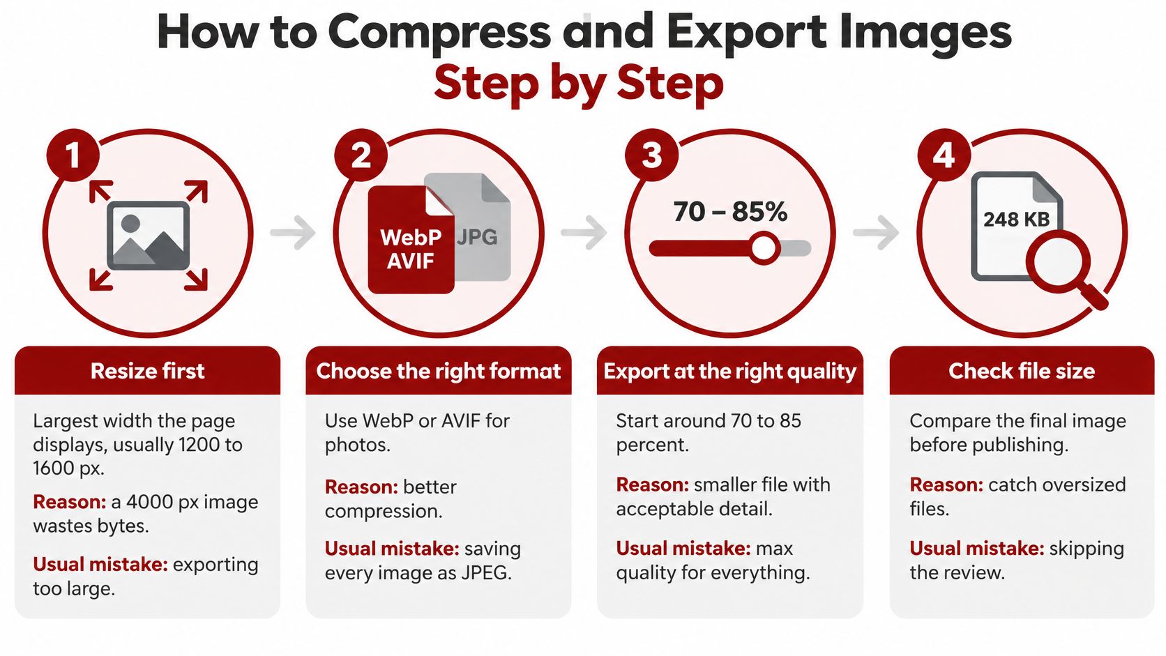
Good compression starts before a compressor touches the file. I would start with resizing, because no quality setting fixes an image that's far larger than the page needs.
What is the correct order for exporting web images
Resize first: Export at the largest width the page displays, usually 1200 to 1600 px for heroes and gallery photos. A 4000 px camera original spends bytes the browser throws away. Exporting too large is the most common mistake.
Crop to the layout frame: Match the crop to the shape used on the page so you don't ship empty sky, driveway, or office wall that CSS will hide. Cropping also keeps the subject large enough to read on a phone.
Choose the format: Use WebP or AVIF for photos, SVG for logos, and PNG or lossless WebP where text must stay sharp. Saving every image as JPEG leaves compression gains on the table.
Export at sensible quality: Start around quality 75 to 80 for photos, then view the result at 100 percent. Check faces, roof lines, tile edges, and gradients for smearing or banding. Saving at maximum quality out of caution usually adds weight without visible benefit.
Compress to the target: Run the file through Squoosh, ImageOptim on a Mac, or a reliable compression plugin. Stop when you reach the size target for that image type and the image still looks clean. Our guide to practical compression techniques for web images covers tool settings in more detail.
Strip unnecessary metadata: Remove EXIF data unless you have a specific reason to keep it. Camera files can carry GPS coordinates from a job site, which can reveal a customer's address.
Name the file descriptively: Use hyphenated words such as prescott-deck-rebuild-cedar.jpg, not IMG_4432.jpg. Then export a JPEG fallback at the same dimensions.
A JPEG fallback is still normal practice. According to HTTP Archive's Web Almanac, in 2024 WebP accounted for 12% of images measured across the web, while JPEG accounted for 32.4% and PNG for 28.4%.
What does a good export look like
Text stays readable, edges stay clean, and there's no visible banding in skies or painted walls. The file should also load promptly on a mid-range phone. If you have to choose between perfect zoomed-in detail and a fast service page, choose the version visitors see at display size.
Serve Responsive Images with srcset, Sizes and Dimensions
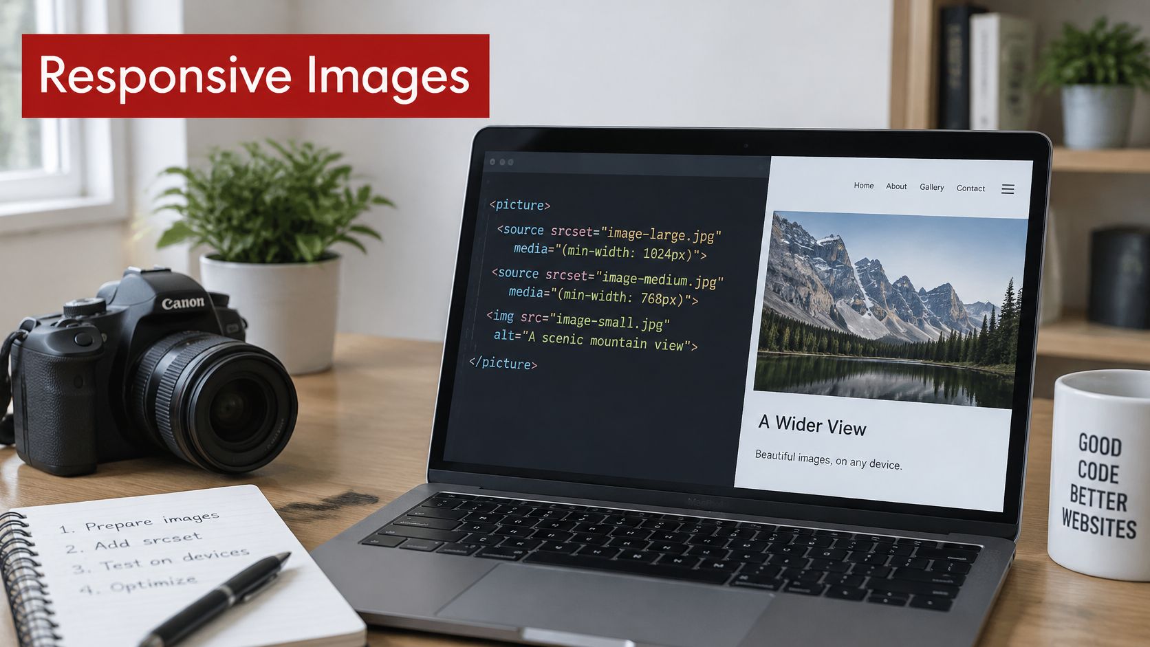
Compression controls each file. Responsive delivery controls which file each device receives. Without it, a phone can download a desktop hero and shrink it on screen, wasting most of the transfer.
How do you set up responsive images
Set dimensions on every img: Add explicit and attributes, or use CSS . The browser can reserve the right space before the image arrives, so text and buttons don't jump.
Create size variants: Export two to four versions, such as 400, 800, and 1200 px wide. List them in with width descriptors so the browser can choose based on screen size and pixel density.
Add a sizes attribute: Tell the browser how wide the image will appear, for example . That means full width on small screens and half width on larger layouts. Without , the browser may guess wrong and download too much.
Use picture for format choices: Wrap sources in a element when you offer AVIF or WebP, and keep a JPEG with a plain as the fallback. Google recommends responsive delivery through or while retaining a fallback .
Prioritize the hero: Mark the likely Largest Contentful Paint image, usually the hero, with . Don't lazy load it. Lazy loading the first visible image delays the content people came to see.
Lazy load below the fold: Add to gallery and lower-page images. They'll load as visitors approach them instead of competing with the hero and headline.
A CDN with image transforms can generate these variants on request from one master file. That's useful for large project galleries, but you still need correct dimensions and priority in the markup.
Don't let a plugin lazy load everything by default. The hero needs the opposite treatment.
Headshots need the same discipline at a smaller scale. Even profile photos have strict display constraints, as shown by these LinkedIn profile image file limits. On your own site, export the headshot for its card size rather than uploading a full camera file.
Image position | Loading attribute | Priority | Dimensions |
|---|---|---|---|
Hero or likely LCP image | no lazy loading | fetchpriority high | width and height set |
Visible image below the hero | eager (default) | default | width and height set |
Gallery image below the fold | loading lazy | default | width and height set |
Header logo | eager (default) | default | width and height set |
Decorative background | CSS background or alt empty | low | aspect-ratio in CSS |
Alt Text, Filenames and Surrounding Copy
Keyword-stuffed alt text is the mistake I would fix first. Alt text isn't a place to repeat "best roofer Prescott" under every photo. Its job is to communicate what the image contributes to the page.
Start by classifying each image as informative, functional, or decorative. That classification decides what the alt attribute should say. Google advises using sharp, high-quality images near relevant text, and descriptive alt text helps search engines understand both the subject and its relationship to the page.
How should alt text change by image purpose
Informative image: Describe what's shown and why it matters, such as "Crew replacing cracked tile on a home in Prescott, Arizona." Don't write "roof repair Prescott best roofer tile roofing."
Functional image: Describe the action, not the picture. A linked phone icon should say "Call our office in Prescott Valley," because that's what activating the image does.
Decorative image: Use an explicit empty alt attribute, , for background textures, dividers, and repeated ornaments. Screen readers will skip it instead of announcing the filename.
More alt text isn't automatically better. Redundant descriptions create accessibility clutter, especially when the caption beside the photo already says the same thing. Our guide to alt text best practices for accessible images gives more examples by image type.
How do you audit filenames and nearby copy
List each image, its purpose, its filename, its alt text, and the sentence beside it. Ask whether removing the image would remove important information. If it wouldn't, the image is probably decorative. If it would, the alt text needs to carry that missing meaning concisely.
Use descriptive filenames such as chino-valley-bathroom-remodel-shower.jpg. Place project photos near copy naming the same service, and use a location only when it's true for that project. Accurate local context helps. Repeating Prescott, Prescott Valley, and Chino Valley under unrelated stock photos doesn't.
How long should alt text be
Keep most alt text under about 125 characters. That's long enough for a specific subject and context, but short enough for screen readers to handle comfortably.
Does every image need a keyword
No. Every informative image needs an accurate description. Include a service or place name only when it naturally describes what's visible and relevant on that page.
Structured Data, Image Sitemaps and CDN Delivery
These three tools solve different problems. Add them when discovery or delivery is failing, not because a checklist says every site needs all three.

When do you need an image sitemap
Use an image sitemap when crawlers may struggle to find images through normal page links. Common cases include JavaScript sliders, images loaded only through CSS, and files hosted on a separate domain. List image URLs under each page entry with image tags and submit the sitemap in Google Search Console. Our guide to XML sitemap best practices explains the submission process.
Say a contractor's project gallery uses a script slider. Visitors can browse dozens of kitchen and roof photos, but the HTML exposes few stable image URLs. An image sitemap gives crawlers a direct inventory instead of hoping the slider gets fully rendered and understood.
When is ImageObject structured data worth adding
Add ImageObject structured data when you publish original photos with clear captions and ownership details. You can provide , , and , but the markup must describe an image visitors can see on the page. Markup for hidden or unrelated images won't help and may be ignored or flagged.
If you're building that markup by hand, comparing the best schema markup generators can help you produce valid code without guessing at required fields. Still validate the result and confirm it matches the visible page.
The short walkthrough below is useful for checking how sitemap and delivery settings fit together before you change production templates.
When does a CDN pay off
A CDN caches images closer to visitors, can resize files on request, and can serve WebP or AVIF based on browser support. It's most useful when phone traffic is steady or galleries are large. Check cache lifetimes and confirm the CDN serves the same stable URL used by the page and sitemap.
Measure Image Performance and Fix Common Problems
Don't judge image work by how a page feels on office Wi-Fi. Run a before-and-after test on your most important service pages, then compare the same templates under similar conditions.
What should you measure before and after
Record mobile Largest Contentful Paint (LCP), Cumulative Layout Shift (CLS), image request count, and total transferred image bytes. Use PageSpeed Insights or Lighthouse in a private browser window. Also note calls and form submissions over comparable traffic periods, because faster pages only matter commercially if visitors can act.
Run each page at least twice. One result can be noise from network conditions, caching, or a busy test server. Compare the same page template, such as two service pages built from the same design, before rolling changes across the site.
Use a realistic hero benchmark. According to HTTP Archive's Web Almanac, in 2024 48% of mobile websites used a Largest Contentful Paint image sized at 100 KB or less. If your Prescott service page hero is several times that size, start there.
Symptom | Likely cause | Fix in section |
|---|---|---|
Slow hero image on mobile | Oversized or lazy-loaded LCP image | Responsive delivery |
Page jumps while images load | Missing width, height or aspect ratio | Responsive delivery |
Heavy image download on phones | Desktop-size file served to small screens | Compression and export |
Images missing from search results | Images loaded only by script or CSS | Structured data, sitemaps and CDN |
Text in graphics unreadable after compression | Quality set too low | Compression and export |
Images not matched to search queries | Generic filenames and vague alt text | Alt text, filenames and surrounding copy |
Which fixes usually pay off first
A slow hero usually means the LCP image is oversized, poorly prioritized, or lazy loaded. Remove lazy loading from that one image, give it high fetch priority, and serve a phone-sized variant. Our guide to lazy loading images without hurting LCP covers where that setting helps and where it harms.
A page that jumps while loading usually lacks width, height, or aspect ratio. Add dimensions before you chase another compression setting. Heavy phone downloads usually point to a missing , an inaccurate value, or a desktop file being reused everywhere.
Measure the transferred bytes, not just the file sitting in your media library. Responsive markup decides what visitors actually download.
A healthy result is straightforward. Mobile LCP should be under 2.5 seconds, CLS should be under 0.1, and transferred image bytes should trend down without a visible loss of sharpness. If calls or form starts improve over comparable periods, keep the template change and apply it carefully to similar pages.
Run Your Image SEO Checklist Before Publishing
Run the same checks on every new service page, project gallery, and blog post. Consistency matters because one uncompressed hero can undo careful work everywhere else.
What should you check on your platform
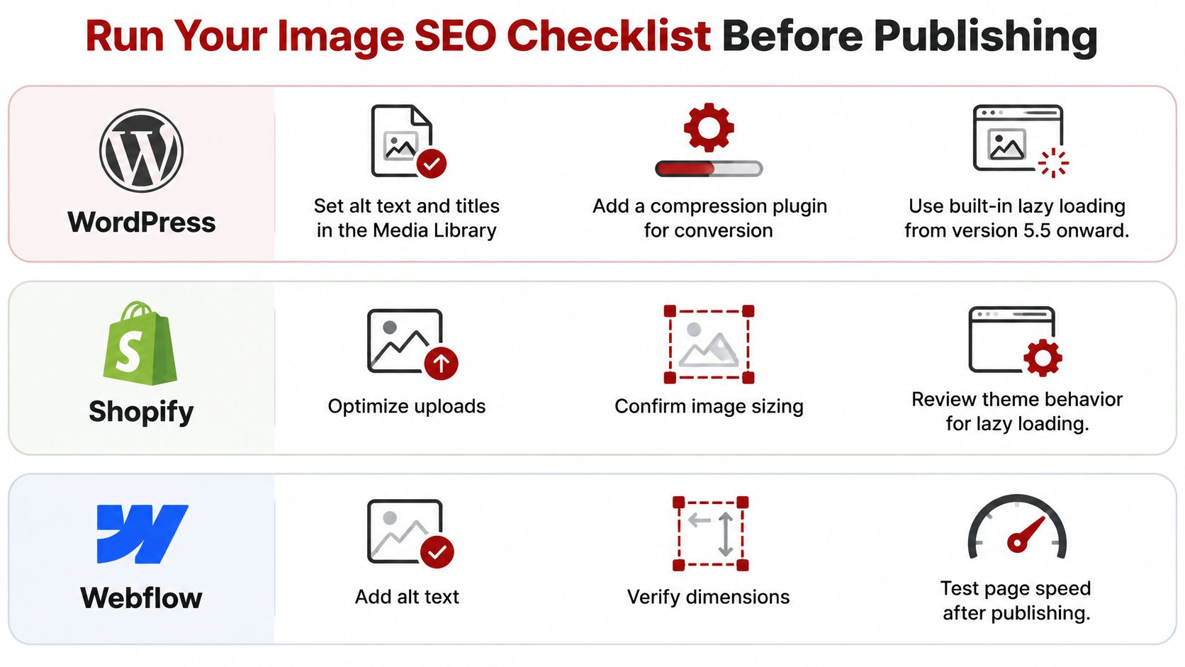
WordPress: Set alt text and titles in the Media Library, add a compression plugin for conversion, and use built-in lazy loading from version 5.5 onward. Confirm the hero is excluded from lazy loading.
Shopify: Add alt text in the product media editor and export files at target sizes before upload. Check how your theme handles responsive sizes and below-fold loading.
Squarespace: Set the alt text field in each image block's settings. Avoid repeated re-cropping after upload, which can make the delivered size harder to predict.
Webflow: Set alt text on each image asset and use responsive image settings for each breakpoint. Test the published page, not only the designer preview.
What is the final pre-publish checklist
Format and size: Every file is at display size in WebP or AVIF where supported, with a JPEG fallback where needed.
Dimensions: Every has width and height, or a CSS aspect ratio reserves its space.
Priority: The hero isn't lazy loaded, and below-fold images are.
Accessibility: Informative images have accurate alt text, and decorative images have empty alt text.
Context: Filenames are descriptive, nearby copy matches the image, and unnecessary metadata is stripped.
Discovery: An image sitemap or structured data is in place where discovery or ownership details require it.
Proof: Before-and-after LCP, CLS, image bytes, and conversion signals are logged.
Silva Marketing has launched more than 500 websites and offers website design services in Prescott, Prescott Valley, and Chino Valley. Our Web Design, Google Ads, Logo Design, SEO, and AI SEO consults are listed as free, so a short strategy call is an option if this checklist feels like a lot to manage alone.
Frequently Asked Questions About Image SEO
Does image file size affect Google rankings
File size doesn't rank a page by itself. Heavy images can slow pages on phones, which affects user experience and the Core Web Vitals signals Google measures. Smaller, correctly delivered files support the page rather than acting as a direct ranking trick.
Do I need WebP to rank in image search
No single format is required. WebP or AVIF with a JPEG fallback can reduce transferred bytes, but correct dimensions, stable URLs, relevant surrounding copy, and loading priority matter more than the file extension alone.
Do I need an image sitemap
Most sites using standard tags don't need one. Add an image sitemap when gallery images load through scripts, sit only in CSS, or live on another domain and may be missed during crawling.
How long should alt text be
Keep alt text under about 125 characters for most images. For example, a crew photo from a Prescott Valley roofing project could use "Roofing crew installing shingles on a Prescott Valley home." That describes the work accurately without forcing in a keyword list.
If your service pages look strong but load slowly on phones, Silva Marketing can audit the images, fix delivery settings, and build the checks into your publishing process for Prescott and Northern Arizona pages. Visit Silva Marketing to request a free consultation and discuss the next practical step for your website.
Comments