
Website Design Mockup Explained for Local Businesses

A website design mockup is a static, near-final visual draft of your website, with real colors, fonts, imagery, and layout, but no clicking yet. In a documented homepage test, a mockup-led redesign reached a 94% success rate compared with 45% for the original layout, and users found a critical link four seconds faster.
You may be looking at a new homepage on a screen and hearing, “Once it's built, you'll be able to click through everything.” That can feel like approving a kitchen from a cabinet sample. You can judge the finish, but you can't yet tell whether the doors open comfortably or whether the sink is in the right place.
A website design mockup gives you a clearer decision point. It's a static, mid-to-high-fidelity visual representation of the final interface, positioned between the wireframe and the working prototype. It shows the intended typography, colors, imagery, spacing, hierarchy, and content placement before interactive development begins. Mockup guidance from Moqups describes this stage as close enough to production that stakeholders can validate important design decisions before engineering work starts.
Silva Marketing is a Prescott-based digital marketing agency serving Northern Arizona service businesses, including contractors, professional practices, and other companies that need more qualified calls and leads. The mockup stage solves a practical problem for these businesses: it lets owners find unclear messaging, misplaced phone buttons, weak trust signals, and awkward mobile layouts while changes are still inexpensive.
This guide explains what a mockup is, how it differs from a wireframe and prototype, how to approve one, what developers need for a clean handoff, and how to test whether a stranger would trust the business enough to call.
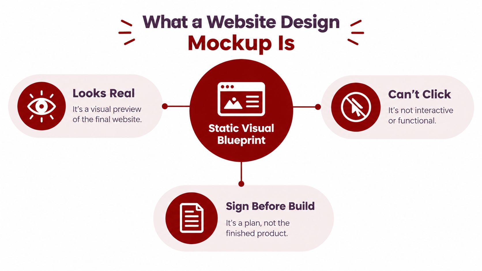
Table of Contents
What a Website Design Mockup Actually Is - What belongs in a useful mockup
Mockups vs Wireframes vs Prototypes - Wireframe vs Mockup vs Prototype at a Glance - Which stage should receive your feedback
Why Mockups Matter for Local Service Businesses - The local questions a mockup should answer
The Mockup Creation and Approval Workflow - The six practical stages
Responsive Mockup Best Practices and Developer Handoff - The specifications developers need - Why the handoff prevents drift
How to Test a Mockup for Trust and Clarity - Questions that reveal confusion - A practical trust review
What to Expect From Your Mockup Project and Next Steps - Website design mockup FAQs
What a Website Design Mockup Actually Is
A mockup answers a visual question: What will this website look like before it becomes interactive? It normally includes the actual brand colors, near-final fonts, representative photography, page sections, calls to action, navigation, and visual hierarchy.
It doesn't behave like a website yet. A phone number may appear on the page, but clicking it won't necessarily start a call. A menu may be shown in its open and closed states, but the mockup itself remains a still composition. That distinction prevents a common misunderstanding: a mockup is not a broken website. It's a design document for making decisions before development.
What belongs in a useful mockup
A decorative image can make a presentation look polished without helping anyone build the site. A useful mockup carries enough detail to guide both the business owner and the developer.
You should expect to see:
Realistic content placement: Headlines, service descriptions, testimonials, contact details, and calls to action appear where visitors will encounter them.
Brand decisions: Colors, typography, imagery, icon styles, borders, buttons, and spacing work together as a consistent system.
Conversion elements: A Prescott contractor might review the placement of a “Request an Estimate” button, service-area language, financing information, or a click-to-call phone number.
Responsive direction: The design shows how important sections adapt when the screen becomes narrower.
Visual hierarchy: The first screen makes clear who the company helps, what it does, and what the visitor should do next.
The practical value is approval. You can ask whether the headline sounds like your business, whether the phone number is easy to find, and whether the page looks credible before a developer turns the design into front-end code.
Practical rule: Approve the design logic before you approve the implementation. Fixing a misplaced section in a mockup is simpler than rebuilding a coded page around it.
A mockup can also support related visual work. If your team needs fast concept imagery for a presentation or campaign, a resource for creating product visuals in minutes can help you explore visual directions. The final website still needs carefully selected, properly licensed assets that fit the brand and load efficiently.
The result should feel close to the finished website without pretending to be functional. That makes the mockup the right place to resolve appearance, clarity, and content placement before the project moves into behavior and code.
Mockups vs Wireframes vs Prototypes
A simple construction analogy makes the distinction clear. A wireframe is the blueprint, a mockup is the furnished model home, and a prototype is the test drive.
The wireframe focuses on structure. It uses simple boxes, labels, and content blocks to answer questions such as, “Where does the service navigation go?” and “Does the homepage lead visitors toward a contact step?” It isn't meant to show the final brand personality.
The mockup adds the visible experience. It answers, “Does this look like a trustworthy Prescott business?” and “Can a visitor immediately see the phone number, service area, and next step?” Because it includes typography, colors, images, and spacing, it's more than a prettier wireframe. It's where brand and conversion decisions become concrete.
The prototype adds behavior. It may let someone open a menu, move through a form, follow a link, or experience a page transition. Its purpose is to test interaction and task flow, not just appearance.
Wireframe vs Mockup vs Prototype at a Glance
Stage | Fidelity | Interactive | What It Answers | When It Is Used |
|---|---|---|---|---|
Wireframe | Low to medium | Usually no | Does the structure and content order make sense? | Early planning and information architecture |
Mockup | Medium to high | Usually no | Does the visual design communicate trust, clarity, and brand identity? | After structure is agreed and before the build |
Prototype | Medium to high | Yes, to a planned degree | Can users complete key tasks and understand the interactions? | Before or during final usability validation |
A business owner who skips the wireframe may spend time debating colors before the page structure is sound. A business owner who treats the mockup as optional may discover too late that the chosen typeface makes service descriptions difficult to scan or that the primary call button disappears on a phone.
Which stage should receive your feedback
Give structural feedback during the wireframe stage. For example, ask whether emergency services need a separate path or whether commercial and residential customers need different landing pages.
Give visual and messaging feedback on the mockup. Ask whether the photography feels local and authentic, whether the headline reflects the actual service, and whether trust signals appear before a visitor has to search for them.
Give interaction feedback on the prototype. Test whether the navigation opens naturally, whether the form makes sense, and whether a visitor can complete a task without getting lost.
A disciplined project uses all three stages for different decisions. The mockup earns its place by making the visual and conversion experience visible before a developer commits it to code.
Why Mockups Matter for Local Service Businesses
A local service website has a short window to answer three questions for a new visitor: Can this company help me, does it serve my area, and should I contact it? A mockup lets you inspect those answers before technical implementation locks the page into place.
For a plumber, roofer, dentist, or electrical contractor in Prescott, the important design choices aren't limited to color palettes. The mockup should make the phone call path obvious, place trust signals where visitors can see them, and show how the page behaves on a mobile screen. Reviews, licenses or credentials when applicable, service areas, project imagery, guarantees, and clear contact options all need room to work without overcrowding the page.
The documented homepage optimization case cited at the start illustrates why this review matters. The redesigned layout performed substantially better on task completion than the original, and users located a critical link faster. The project also uncovered usability issues affecting all users as well as additional problems specific to mobile users. The full usability case study shows how a wireframe and mockup can expose problems before launch rather than after visitors encounter them.
The local questions a mockup should answer
Ask these questions while the page is still a visual draft:
Can a stranger identify the service quickly? A familiar owner may understand an insider term that a first-time visitor won't.
Can the visitor tell where the company works? Prescott, Prescott Valley, Chino Valley, Dewey-Humboldt, and other Northern Arizona service areas should appear where they support the decision, not only on a hidden contact page.
Can the visitor find the preferred contact method? A phone-first business shouldn't bury its number beneath a large decorative section.
Does the page feel credible? Generic stock photography, vague claims, or an unfinished-looking footer can weaken confidence.
Does the mobile version preserve the same clarity? A design that works on a wide monitor may become crowded when stacked on a phone.
A local business owner shouldn't approve a mockup because it looks attractive in a meeting. Approve it because a new visitor can understand the offer and find a trustworthy next step.
The mockup also protects the budget by making disagreement visible early. Changing a section order, headline, button treatment, or image direction before development is generally simpler than asking a developer to revise completed templates and responsive styles. That doesn't eliminate every later decision, but it keeps the most expensive design debates out of the build.
The Mockup Creation and Approval Workflow
A reliable workflow begins before anyone chooses a font. The team first needs to understand the business, its customers, its services, its service area, and the action the website should support. A usability-focused process recommends starting with user research, moving into visual design and mockups, and testing later designs with participants performing the same tasks so the team can compare ease and completion. The usability workflow guidance supports that progression.
The transition from paper prototypes to low-fidelity digital evaluation methods also shaped modern web design. Research on Web Design Usability Evaluation found that low-fidelity mockups helped inspectors identify usability problems earlier in the development cycle, and the method identified more problems in less time than the predecessor approach. The Web DUE study reinforces the value of examining an idea before building the full interface.
The six practical stages
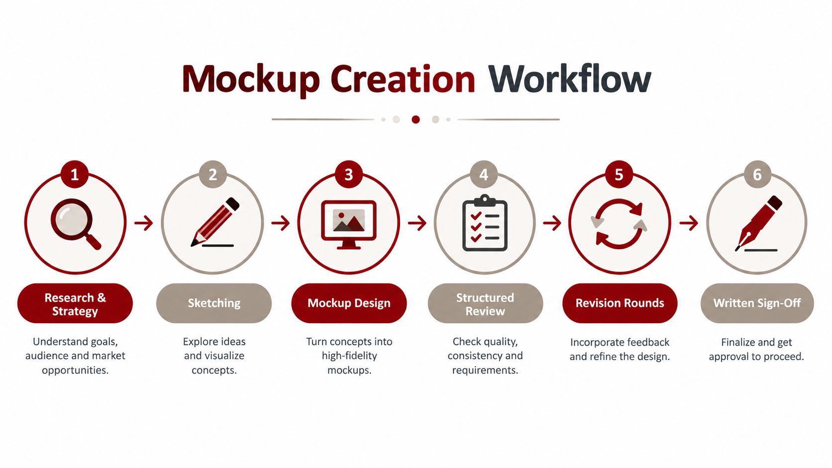
Research and strategy: Gather business information, identify customer needs, review competitors, clarify services, and define the primary conversion path. For a Northern Arizona contractor, that may include separating emergency calls from planned projects.
Sketching: Arrange the page sections and content priorities without getting distracted by visual polish. This stage exposes missing information and weak page order.
Mockup design: Apply the brand direction, imagery, typography, spacing, calls to action, and responsive considerations to the agreed structure.
Structured review: Review the page against specific questions instead of general reactions. “The button feels wrong” is less useful than “The phone CTA is difficult to find on the mobile composition.”
Revision rounds: Group related changes together, such as messaging, imagery, layout, and brand details. This keeps feedback coherent and avoids scattered requests that create new inconsistencies.
Written sign-off: Record what has been approved, what remains outside the current scope, and what will be handled during prototyping or development.
Prescott clients should receive a clear explanation of what each review covers. A mockup review is the right time to discuss the headline, section order, colors, imagery, and placement of trust signals. It isn't usually the right time to debate animation timing or the exact behavior of a form that hasn't been prototyped yet.
The agency's broader website design process provides context for how strategy, information architecture, wireframing, and pre-development review fit together. A transparent process should also make revision expectations and approval responsibilities clear, without forcing a business owner into a long-term commitment before the work is understood.
Responsive Mockup Best Practices and Developer Handoff
A handoff-ready mockup tells a developer more than where to place a headline. It describes the rules that keep the design consistent when the screen, content, or component state changes.
The first requirement is responsive direction. A desktop composition alone can't show how navigation collapses, how cards stack, how a phone number remains available, or how a long service title wraps on a narrow screen. The mockup should include notes or compositions for the key breakpoints that matter to the project, along with the intended behavior of major sections.
The specifications developers need
A useful handoff typically includes:
Typography: Font family, weight, size, line height, letter spacing, and hierarchy for headings, body copy, labels, and navigation.
Color system: Exact brand colors, background colors, text colors, link colors, borders, and interaction states.
Spacing measurements: Padding, margins, gaps, section rhythm, container widths, and alignment rules.
Component states: Default, hover, focus, active, disabled, and error states for buttons, links, menus, and form controls.
Responsive notes: What stacks, hides, resizes, scrolls, or changes order at narrower widths.
Content rules: What happens when a heading is longer, a review contains more text, or a service list expands.
Component and mockup guidance from Clique Studios emphasizes responsive notes, exact colors, typography, spacing and padding measurements, and button states because developers use those details to produce more pixel-accurate front-end code.
Accessibility belongs in this review, not as a last-minute audit. For text, documented contrast thresholds are 4.5:1 for text smaller than 24px or 19px bold, and 3:1 for larger text or 19px bold. This accessibility documentation guide explains how those thresholds can be applied directly while documenting a design.
Why the handoff prevents drift
Without specifications, developers make reasonable guesses. One button may receive a slightly different red, one section may use a different gap, and a mobile heading may become too small to preserve the desktop layout. Each choice can look minor in isolation, but the completed website gradually moves away from the approved design.
A clear handoff reduces those guesses. It also gives the business owner a fair review standard because the team can compare the build with an agreed visual system rather than debating personal preferences after launch. Mobile behavior deserves special attention for service businesses, and mobile website optimization guidance can be useful when the project needs a separate phone-first review.
How to Test a Mockup for Trust and Clarity
The most useful question isn't, “Do I like this design?” It's, “Would I call this company?”
Owners often approve a mockup because it feels modern, clean, or consistent with the brand. Those qualities matter, but they don't prove that a visitor understands the service or trusts the business. A beautiful page can still leave someone wondering whether the company serves their neighborhood, whether the business handles their type of job, or what to do next.
A lightweight test can reveal those problems before development. Show the homepage mockup briefly to someone who isn't involved in the project, then ask what they remember. Don't explain the business first. Their immediate interpretation is more useful than a guided reaction from someone who already knows the company.
Questions that reveal confusion
Use plain prompts and record the answers without defending the design:
What does this company do?
Who do you think this page is for?
Where do you think the company serves customers?
What would you click or do next?
What makes the business seem trustworthy?
What, if anything, feels unclear or missing?
Would you call this company for the problem shown here? Why or why not?
The answers tell you more than a preference vote. If a participant says the colors are attractive but can't identify the service, the page has an information problem. If they understand the offer but can't find a contact path, the page has a navigation or conversion problem.
A practical trust review
Check whether the mockup presents evidence in a believable order. A service business may need a clear service description, recognizable location language, relevant project imagery, reviews or testimonials, and a direct contact option. None of these should feel like decoration. Each should help a visitor decide whether the company is credible and relevant.
The social proof strategy guidance can help teams think about where evidence belongs in the page experience. The mockup is the right place to test that placement because you can see whether proof supports the call to action or gets lost below it.
Accessibility testing should include people with disabilities where possible, not only automated checks. Accessibility research and usability guidance recommends addressing accessibility before development and involving disabled people in research and usability testing. That approach improves the quality of the decision, especially when visual trends compete with readability and straightforward navigation.
What to Expect From Your Mockup Project and Next Steps
A healthy project feels orderly rather than mysterious. A local contractor might begin by clarifying its service categories, Prescott and surrounding service areas, ideal customer, phone workflow, and strongest proof of quality. The design team then sketches the page structure, develops the visual mockup, and reviews whether a first-time visitor can understand the offer without an owner standing nearby to explain it.
The contractor's feedback should be specific. It may request a clearer emergency-services path, a more prominent phone button, different project photography, or a service-area statement that includes Northern Arizona communities. Those changes belong in the mockup review. Questions about form behavior, animation, and technical integrations can be recorded for the prototype and development stages.
A project timeline should be agreed in writing, including who supplies content, who approves revisions, which files are included, and what happens when the business changes direction. The website redesign RFP guidance can help a business describe those expectations before comparing providers.
The publisher behind this guidance reports experience with 500+ websites launched and offers custom website design, redesign, search engine optimization, and Google Ads for Prescott and Northern Arizona businesses. Its stated approach includes free consultations, transparent project communication, and no long-term contracts. Ask any agency how it handles source files, revisions, accessibility, mobile layouts, and written approval before you commit.
Website design mockup FAQs
How long does the mockup stage take?
The timing depends on the number of pages, the readiness of the content, the complexity of the brand, and how quickly stakeholders provide focused feedback. A single landing page usually requires a different review process from a full service website with several templates and audience paths. Ask for a project schedule that identifies research, first presentation, revision windows, and approval.
Who owns the mockup files?
Ownership depends on the written agreement. Before work begins, confirm whether you receive editable design files, exported assets, source imagery, typography licenses, and usage rights. Also ask whether ownership transfers after payment or remains with the agency.
Can a mockup include real website copy?
Yes. Real copy is preferable when possible because word length affects hierarchy, spacing, mobile wrapping, and the prominence of calls to action. Placeholder text can make a layout appear successful until the actual service descriptions create unexpected crowding.
What should happen after mockup approval?
The approved design should move into a prototype or development handoff with documented measurements, states, responsive behavior, accessibility considerations, content, and assets. The completed build should then be reviewed against the approved mockup before launch.
Silva Marketing offers custom website design and redesign for service businesses that need a clear, credible path from search visit to phone call or lead. Visit Silva Marketing to request a free consultation and discuss how a structured website design mockup could support your Prescott or Northern Arizona business.
Comments